
Look around any matatu, office or campus in Kenya and you will see why your website must work beautifully on a phone. The large majority of Kenyans go online on mobile devices, often on prepaid data and mid-range Android phones. This guide to mobile-first website design in Kenya explains what mobile-first really means, the design and technical decisions that matter, and how to test your own site.
What does mobile-first mean?
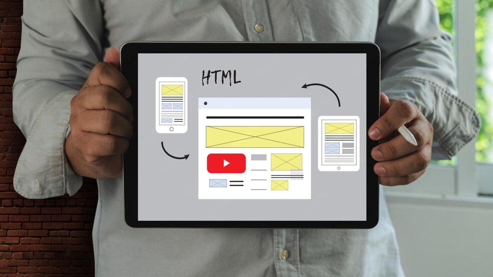
Mobile-first means designing for the smallest screen first, then adding enhancements for tablets and desktops. It is different from "responsive", where a desktop design is squeezed to fit a phone. When you start with mobile, you are forced to prioritise: the most important message, the clearest call to action and the fastest path to what visitors need.
Why mobile-first matters in Kenya
- Most traffic is mobile: for many Kenyan businesses, the majority of website visitors use phones.
- Data costs money: heavy pages literally cost your visitors airtime.
- Networks vary: a site that is fast on office Wi-Fi in Westlands may crawl on 3G upcountry.
- Google indexes mobile first: Google mainly uses the mobile version of your site for ranking.
- Payments happen on phones: M-Pesa checkout is a mobile experience.
Design principles for mobile-first websites
1. One clear message per screen
The first screen a visitor sees should say what you do, for whom, and what to do next. Avoid sliders and long animations that push content down.
2. Thumb-friendly navigation and buttons
Make buttons large enough to tap easily, with space between them. Keep key actions such as "Call", "WhatsApp us" and "Book now" within easy reach.
3. Readable typography
Use a comfortable base font size, short paragraphs and strong contrast. Many people read outdoors in bright sunlight.
4. Short, simple forms
Ask only for what you need. Use the right input types so the number keypad appears for phone numbers, and autofill where possible.
5. Content in the right order
On a phone, content stacks vertically. Plan the order deliberately: benefit, proof, offer, action. Do not hide important information in desktop-only sidebars.
Technical essentials
- Compressed, modern images: WebP or AVIF, sized for mobile screens, with lazy loading below the fold.
- Lightweight code: fewer plugins, scripts and fonts.
- Caching and a CDN to serve files quickly.
- Core Web Vitals: fast loading, quick response to taps and no layout jumps. Read why your website is slow in Kenya.
- Click-to-call and WhatsApp links that open the right app instantly.
Mobile-first for online shops
For e-commerce, mobile-first is essential. Product photos must look sharp but load quickly, filters must be easy to use with a thumb, and checkout must be short, with M-Pesa STK push so customers approve payment on the same phone. See our guide to high-converting product pages and how to start an online shop in Kenya.
How to test your website on mobile
- Open your site on a mid-range Android phone using mobile data, not Wi-Fi.
- Run Google PageSpeed Insights and look at the mobile score and Core Web Vitals.
- Try to complete your main goal, such as booking, buying or enquiring, using only your thumb.
- Check text size, button spacing and whether anything overflows the screen.
- Ask someone unfamiliar with your business to find your prices and contact details.
Real examples
When we revamped the Labtest Zote website, mobile visitors needed to search lab tests and book collection quickly. Read how we designed a medical laboratory website in Kenya. For DFAM Care, patients book and pay from their phones; see building a clinic booking system in Kenya.
Common mobile mistakes
- Pop-ups that cover the whole screen and are hard to close.
- Tiny text and links too close together.
- Huge hero images and background videos.
- Menus with too many levels.
- Phone numbers that are not clickable.
A mobile-first page, section by section
Here is how we typically structure a service page for phones:
- Header: logo, a single menu button and a visible call or WhatsApp action.
- Hero: a clear headline, one supporting sentence and one main button. No slider.
- Proof: a review, client logos or a key result, visible within the first scroll.
- Benefits: three to five short points with simple icons.
- Details: pricing or packages, process and FAQs in expandable sections.
- Action: a short form or booking button, repeated at the end of the page.
On desktop, the same content spreads into columns, but the order and priorities stay the same.
Key takeaways
- Most Kenyan visitors browse on phones, often on mobile data.
- Design the phone experience first: one message, one action per screen.
- Large tap targets, readable text and short forms make a big difference.
- Compressed images, lightweight code and caching keep pages fast.
- Test on a mid-range Android phone on mobile data, not office Wi-Fi.
- Google ranks the mobile version of your site, so mobile quality affects SEO.
Frequently asked questions
Is responsive design the same as mobile-first?
Not quite. Responsive design adapts layouts to screen sizes; mobile-first is an approach that starts with the phone experience and builds up.
Do I still need a good desktop site?
Yes. Corporate buyers often research on desktops. Mobile-first simply means the phone experience is never an afterthought.
Can you fix my current site or do I need a redesign?
Many sites can be improved with targeted fixes. A website audit shows which is better value.
Do I need a mobile app instead?
For most businesses, no. A fast mobile-first website works for every visitor without a download, is found on Google and costs far less to build and maintain. Apps make sense when customers use your service several times a week and need features like offline access or push notifications.
Design for how Kenyans actually browse
Every website we build is designed mobile-first and tested on real phones and networks. Explore our business website development service or book a free discovery call.



Join the conversation 0
Have a question, a different take or a result of your own to share? Leave a comment. Our team reads every one and replies where we can help.
No comments yet. Start the conversation.
Your question might be the one other readers are wondering about too.
Write the first comment