
Overview
THE OBJECTIVE
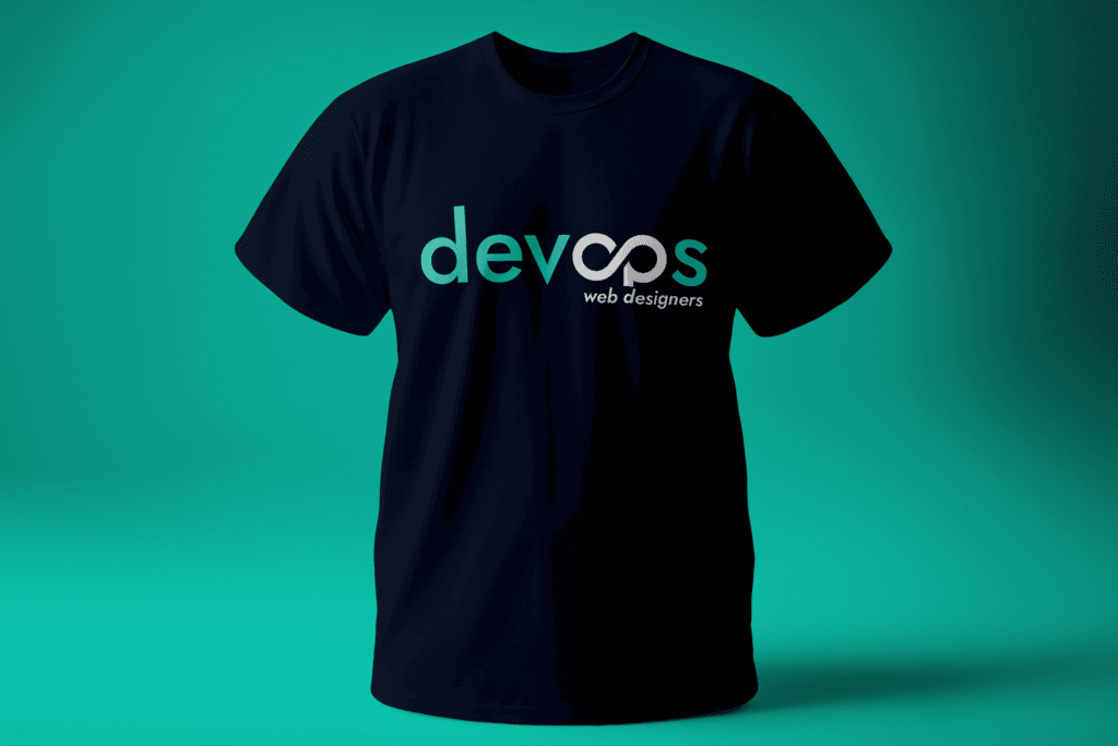
DevOps Web Designers partnered with Venda Technologies for a complete visual identity overhaul. The objective was to strip away the legacy design and engineer a modern, balanced logomark—one with sharp edges and subtle tech cues that could scale effortlessly across client decks, digital forums, and web platforms.
Live Project: Visit DevOps Web Designers Live ↗
Problem
THE CHALLENG
Even the best developers struggle to sell premium services if their branding looks like it was pulled from early-2000s clipart. A weak visual identity creates a subconscious disconnect between the premium quality of the code and the perceived value of the agency.
The inefficiencies included:
Diluted Credibility: A generic logo that failed to communicate their actual level of technical expertise.
Inconsistent Branding: Fragmented visual applications across their website, social media, and client pitch decks.
Loss of Confidence: A visual identity that the sales and engineering teams found themselves subtly apologizing for during high-ticket client meetings.
A fragmented brand identity was extending their sales cycles, requiring the team to work twice as hard to prove their technical competence.
Approach
THE STRATEGY At Venda Technologies, we don’t just draw logos; we build visual systems. We approached this redesign as a branding architecture build, ensuring the new identity felt native to the high-end tech ecosystem.
The solution included:
Clean, Scalable Logomark: Developed a sharp, modern logo engineered to maintain perfect legibility whether displayed as a 16px browser favicon or on a massive tech conference banner.
Tech-Forward Aesthetics: Integrated subtle visual cues that nod to development, operations, and connectivity without being aggressively literal or cliché.
Unified Visual System: Deployed a comprehensive brand guideline covering typography, color palettes, and spatial rules to ensure absolute consistency across all future touchpoints.
"It’s clean. It’s sharp. It finally feels like us."
Kelvin Musagala - CEO DevOps Web Designers Tweet
Why Workflows are the New Software
THE RESULTS
The new visual identity gave the DevOps team the confidence to match their backend engineering skills. The logo acts as a silent sales tool, establishing immediate trust before a single line of code is ever discussed.
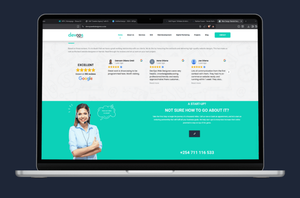
- Instant Credibility across Nairobi tech meetups, online forums, and corporate pitch decks.
- Instant Credibility acA timeless, highly recognizable brand identity that perfectly reflects their premium engineering capabilities.ross Nairobi tech meetups, online forums, and corporate pitch decks.
- Self-Correction: Modern workflows now include feedback loops. If an agent fails at a task, it can analyze the error and try a different path without human intervention.
Impact Statement
A logo is the tip of the spear for your brand. By aligning their visual identity with their actual technical prowess, DevOps Web Designers immediately elevated their market positioning, allowing them to attract and close better clients.