Imagine walking into a beautiful, high-end supermarket in Nairobi. The lighting is perfect, the aisles are spotless, and the shelves are perfectly organized. You find exactly what you want—a new pair of shoes—and you happily walk up to the cashier to pay.
But instead of just taking your money, the cashier hands you a two-page form.
They ask for your home address, your postal code, your province, and the name of your company. Then, when you finally take out your phone to pay with M-Pesa, they tell you to go to a different building across the street to complete the payment.
What would you do? Like most people, you would probably drop the shoes on the counter and walk out.
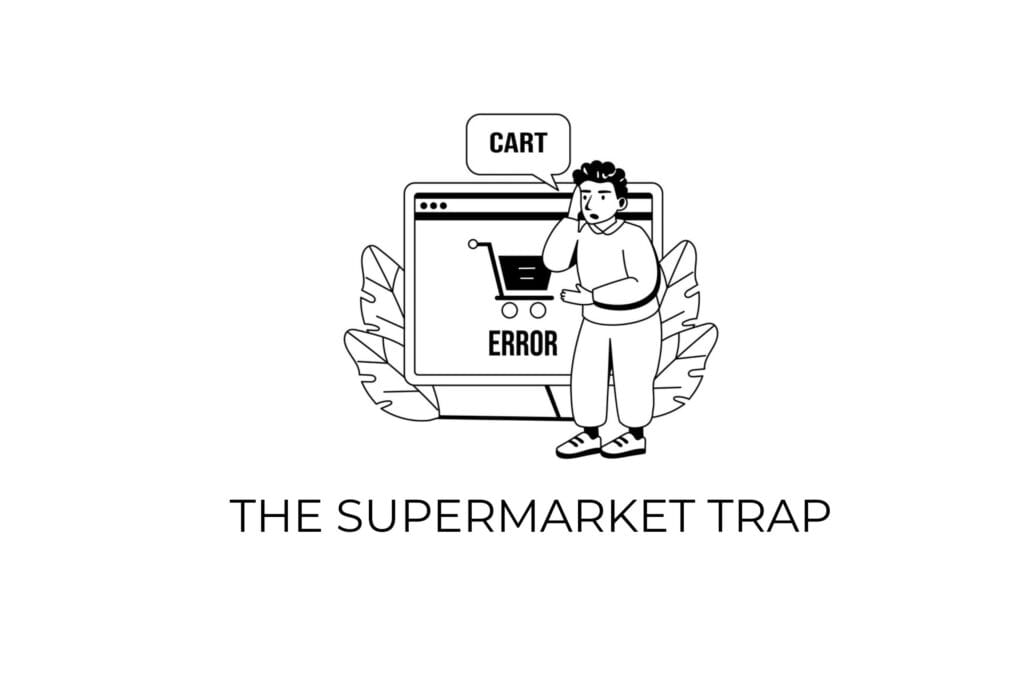
In the digital world, this is called cart abandonment. And if you run an e-commerce website in Kenya, it is likely happening to you every single day.
Business owners spend thousands of shillings on marketing, social media ads, and beautiful product photography to get people into their “digital supermarket.” But because they use cheap, generic website templates, the checkout process is a nightmare.
Here is why generic checkout flows are secretly killing your sales, and how the best web designers in Nairobi fix this problem by focusing on revenue engineering, not just aesthetics.
The Problem with “Copy and Paste” E-commerce.
When a web designer uses a cheap, ready-made template (like a basic WooCommerce theme) to build your online store, that template is usually designed for a global audience. It was built for a shopper sitting at a desktop computer in New York, not a shopper using a smartphone in Nairobi.
Because of this, the checkout page comes with built-in friction that frustrates local buyers:
1. Useless Questions
Generic checkouts ask your customer for a “Zip Code,” a “State/Province,” or a “Billing Address.” In Kenya, we rarely use these to deliver a t-shirt or a bottle of lotion. Every extra box a customer has to fill out is an excuse for them to get tired, close the tab, and buy from your competitor on Instagram instead.
2. Clunky, Manual Payments
A customer is most nervous right at the exact moment they are about to spend money. If your website forces them to manually type in a long Paybill or Till number, switch to their M-Pesa app, and then wait for your staff to manually verify the transaction, you lose their trust—and the impulse buy.
3. Visual Distractions
When a customer is ready to pay, they should not see your blog links, your social media icons, or pop-ups asking them to join a newsletter. Generic templates leave all this clutter on the screen, distracting the buyer from doing the only thing that matters: completing the purchase.
Why e-commerce traffic fails to convert at the checkout line.
*Data modeled on localized checkout drop-off rates.
Pretty Doesn’t Pay the Bills
A lot of founders think a good website is just a website that looks beautiful. But a beautiful website that cannot process a sale smoothly is just an expensive digital brochure.
When you are looking to hire the best web designers in Nairobi, you need to look for a partner who talks about your Return on Investment (ROI).
At Venda Technologies, we do not just design websites; we engineer digital growth platforms. We know that design without strategy is just decoration. Our primary goal is not just to make your brand look premium but to clear a frictionless path straight to the “Buy” button.
Average Conversion Rate
Generic Theme vs. Venda Custom Architecture
On a store generating 10,000 visitors, this difference equals 360 extra sales per month.
How We Engineer a Checkout That Actually Converts
When we build a custom e-commerce platform, we strip away everything that does not help the customer buy.
The 3-Step Rule: We engineer the flow so that a customer can go from seeing a product to completing the purchase in under three steps. We only ask for the exact information needed to make the delivery—nothing more. No zip codes.
Seamless Local Payments: We integrate custom M-Pesa STK Push and Paystack APIs directly into the site. The customer clicks “Pay,” a prompt instantly appears on their phone, they enter their PIN, and the website automatically confirms the order. No leaving the site. No manual verification needed by your staff.
Building Trust on Sight: We design the checkout page to feel secure, placing trust badges, clear return policies, and secure encryption symbols exactly where the customer’s eyes are looking to remove any last-second hesitation.
Stop Making Your Customers Work So Hard
If your website is getting traffic but you are not seeing the sales match up, you do not need more marketing. You need a better system.
A cheap template saves you money today, but it costs you customers every single day after.
Are you ready to stop losing money at the checkout line?
Also Read
The 2026 Guide to Website Maintenance: Why Digital Infrastructure Requires Continuous Engineering
A modern website is not a static digital brochure; it is a complex, living software application.